Baby Cubes Case studyKeeps baby puree fresh as the day you made it!
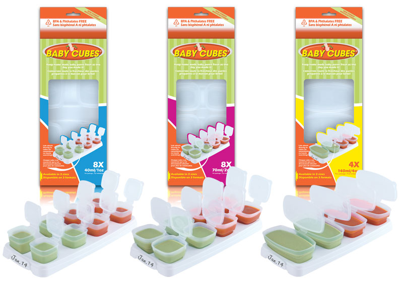
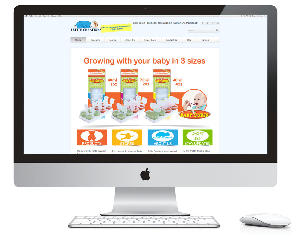
OVERVIEW: The client already had an established operation, but was looking to take the next step. They wanted a uniform brand that would make them look professional, fun, and give them their own identity that could be applied to a variety of different media. Baby Cubes was looking to update the look of their packaging from original packaging SOLUTION: I create a logo that has a timeless modern feel, which included an illustration of a baby cube and strawberries for a clear association of the product. Designed packaging that can stack easily on a shelve or hanging. In the front of the packaging have a window that will display the product. Create a design with fun colours that says food, fun mom and baby. Created photography and text to place on the front, sides and back of the packaging to demonstrate the ease of use and practicality of the product. Designed a website with the same look and feel was created to demonstrate the practicality and the ease of use of the product. RESULT Baby cubes saw their business grow rapidly since the re-branding. They are taking on bigger clients, and they have continuously returned to me for more design material. CLIENTS TESTIMONIAL
“Your creative package designs and photography, always creates a positive buzz in our company, uplifts the spirits of our employees and rejuvenates our sales. Thanks Amal” Rock D. President Baby Cubes Baby Cubes can be found at:
|
Logo Design
Packaging Design
Website Design
Click bellow images to view more case studies
|


